Article prepared with the support of The View — a studio where renders turn skeptics into buyers.
M: Ivan, you have over 10 years of experience in 3D rendering and more than 3,000 projects under your belt. You must know why some renders captivate viewers, while others are scrolled past like toothpaste ads?
Ivan Masanin: (smiles) It’s simple. Most people think of a render as “Photoshop for buildings.” In reality, it’s a story. If there’s no emotion in the frame, the viewer won’t remember your project — even if the colors are perfectly matched. The secret? Details! Nuances that a non-specialist might overlook are what differentiate a “pretty picture” from a powerful marketing tool.
Let’s explore the top five nuances of a perfect render and how to choose a contractor that can actually create one.
1. Atmosphere: When Does a Render Become a Dream?
M: What separates a basic render from one with a “wow effect”?
Ivan: First, it depends on the 3D artist’s professionalism and experience. Second, clients and tasks vary. Some need a sketch approved by a municipality — schematic visuals suffice. But for sales? You need emotion.
For example, some developers fixate on material accuracy, which undermines the “wow factor.” They might say, “This wall is too dark; lighten it.” The artist then removes dramatic, contrast-rich lighting and adds artificial lamps to match the wall’s exact color. Sometimes, we even retouch shadows or adjust hues to align with a paint supplier’s palette.
Yes, the render should resemble the future building. But in today’s world, where people consume vast amounts of visual content, a striking render that grabs attention matters more than pixel-perfect compliance with blueprints.
M: Okay, “atmosphere over accuracy.” But don’t clients also demand alignment with technical drawings?
Ivan: Imagine you’re selling a lifestyle, not concrete and glass. Suppose a client sends 20 revisions on facade shades. If the render has flat, lifeless lighting, even Pantone-perfect accuracy won’t evoke emotion.
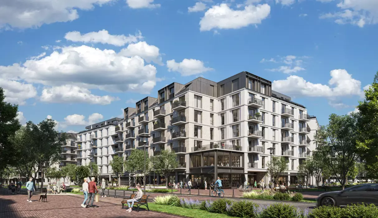
We once worked on seaside apartments. Instead of “correct” daylight, we added sunset with golden reflections on windows. The client initially protested: “The sun doesn’t set there!” But those renders tripled website engagement.
Key takeaways:
Avoid over-editing — trust the artist. A “sky full of diamonds” beats documentary precision.
2. Realism: How to Trick the Brain
M: After 10 years and 3,000 projects, you’ve surely developed an “artistic instinct.”
Ivan: Even those without formal art training recognize beauty. People remember attractive, emotional visuals. A 2020 SAGE study confirms: the brain recalls emotions, not details.
Composition
M: What do you mean by “composition”?
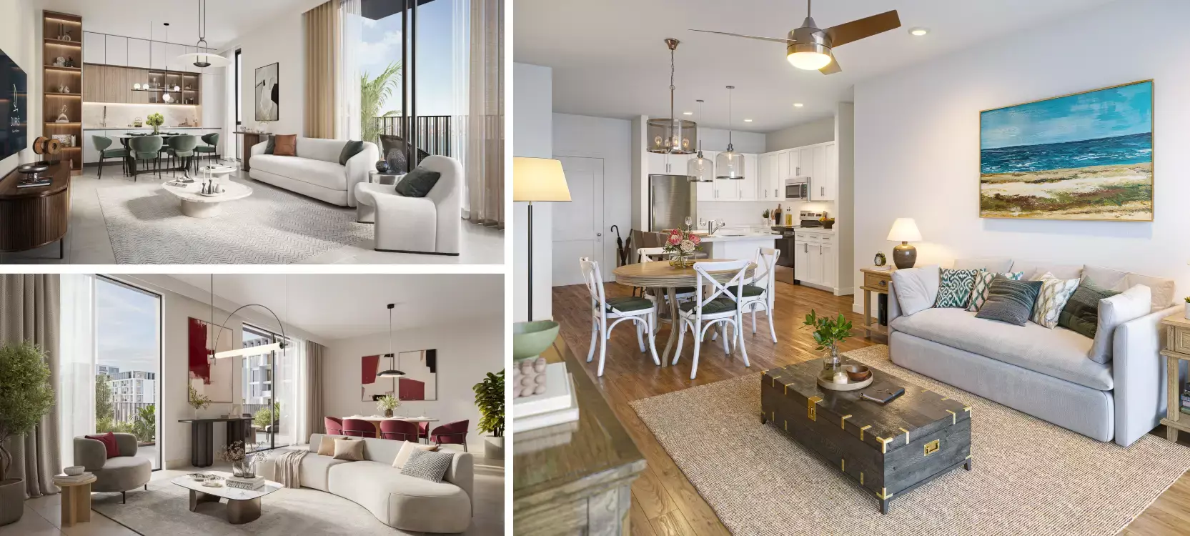
Ivan: Don’t cram everything into one frame. Use two shots of the same location with strong composition. Overloaded visuals get ignored.
Detailing: Small Touches That Matter
M: You mentioned “details.” Do they create realism and breathe life into a render?
Ivan: (showing two renders) See the difference? The first is sterile, like a mannequin in a window. The second not only shows a realistic view of the property, but people walking their dogs, luxury cars driving by, plant life and accurate shading. Which inspires trust to you?
Compare a minimalist render to one with intricate details:
Generic:
Perfect:

Secrets:
People: Without them, a building is a museum piece. Add natural poses.
Shadows: Golden-hour lighting creates drama.
Furniture & decor: Align with the project’s style.
Plants: Greenery adds life and warmth.
Effects: Chimney smoke, puddle reflections — the brain believes it’s real.
M: How do you avoid overdoing it?
Ivan: Three “anchors” suffice: a tree branch by a window, coffee on a table, a bike at the entrance. That’s already a story.
Lighting
M: What else adds emotional depth?
Ivan: Lighting sets the mood. Rain evokes melancholy; sunshine, joy. Renders must be associated with something desirable. Use dramatic sun positions, long shadows, and golden-hour lighting. Even if a sunset isn’t feasible, optimize daylight shadows for impact.
3. Brand Alignment & Project Style
M: Architects favor minimalism but marketers want bold accents. Who wins?
Ivan: (laughs) The eternal debate! Once, we designed renders for luxury housing. The client demanded “glamour” — crystal chandeliers, gold. But the target audience preferred minimalism. We compromised: velvet sofas, veined marble.
Style and atmosphere must reflect the concept.
Consider:
Style unity: Architecture, interiors and landscape should harmonize. Mood: The render should evoke emotions aligned with the project’s ethos (coziness, luxury, modernity).
Also:
For online use: Match the website or social media’s design language. For print: Use high-resolution assets and brand color systems.
4. Interactivity and Animation
M: Why should clients “walk through” a render?
Ivan: 3D tours and animations immerse buyers, making projects memorable. A ScienceDirect study proves interactivity boosts conversions by 40%. That’s why The View has prioritized interactive content since day one — from complex 3D tours to affordable AI-enhanced videos.
Rendered Virtual Tours:
Autoplay and screenshot tools for unlimited content generation. Versatile applications like sales presentations and trade shows. Guided tours to maximize sales conversions. Integration with major MLS systems.
5. Service: Why Some Studios Miss Deadlines
M: How do you avoid receiving an unfinished draft after a month’s wait?
Ivan: We break the process into stages: sketches/grayscale (for composition approval), lighting/textures, then details. Now, clients will be able to track the progress and can’t say, “I dislike the angle” at the end.
Why The View?
1,000+ completed projects enable foresight.
Final renders delivered in multiple formats (print, web).
A team of managers, architects and designers collaborate to ensure quality and service.
Conclusion: The Render as a Story
M: Your top advice for choosing a partner?
Ivan: Share details openly. Provide references and describe your vision. Not all contractors ask. Trust matters.
P.S. The View sometimes hides “Easter eggs” in renderings with client-branded elements like a logo on a cup. Try it — it outperforms discounts.
Remember, crafting a “sticky” render is an art that demands detail, technical skill and creativity. We hope this article helps you recognize what effective renders really are and choose partners who deliver visuals that sell.
Ready to outpace your competitors? See how we help our clients do it →